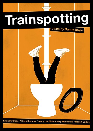
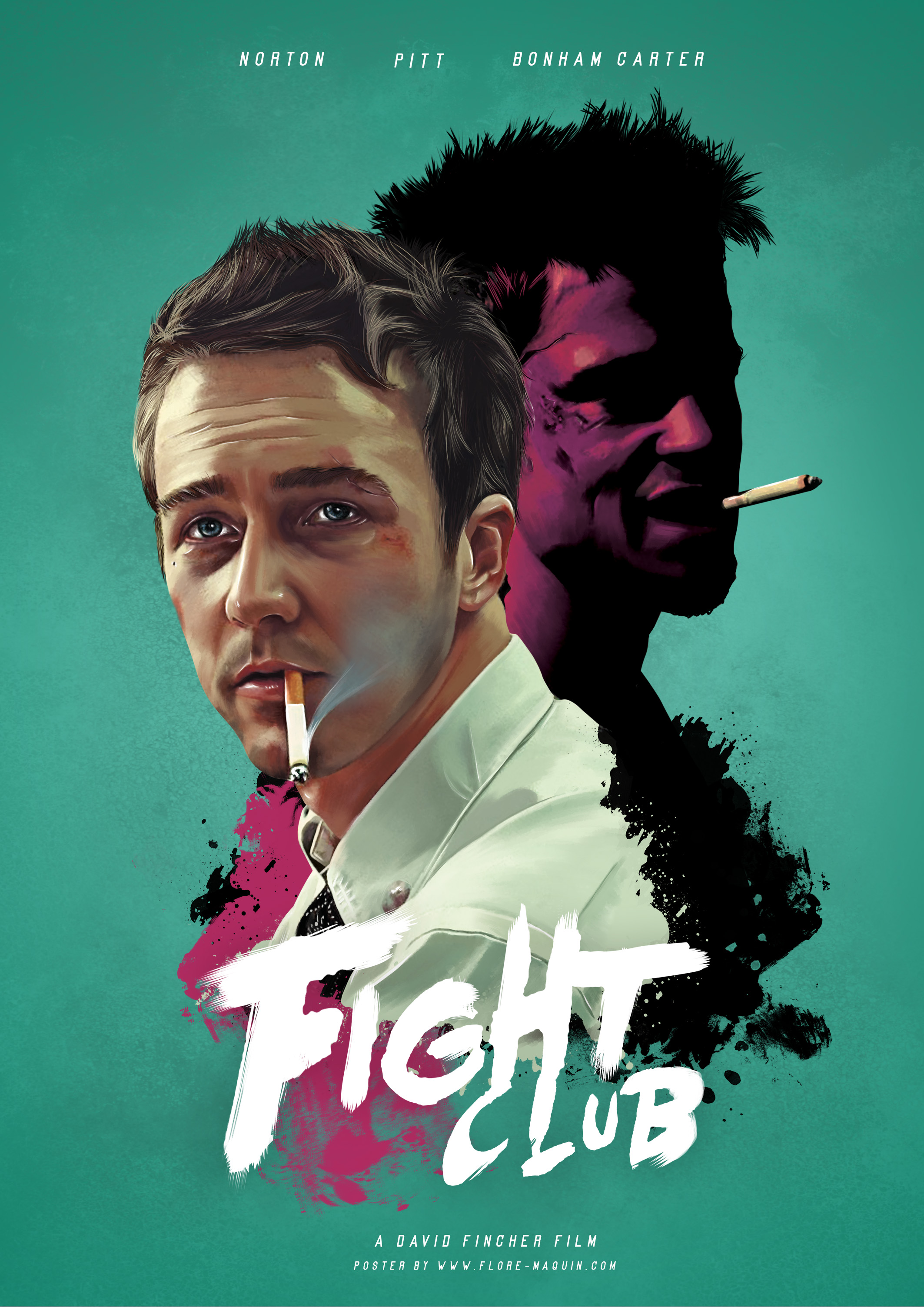
-how do they put the film in context
-what other info do they provide
-credit block
60s film poster conventions
The 1960s was a decade of unprecedented change. Political, social, cultural and aesthetic upheavals left no-one unaffected. They left their tracks in the world of design, too - creating fresh ways of thinking and releasing unbelievable creativity.
To put it another way, the 1960s was the decade in which design definitively established itself as a force that moved all strata of society, influenced their buying decisions and found a natural, identity-determining place in everyday society.
The psychedelic movement and graphic design: Colour exploded, with the use of opposite colours to create vibrating images. Typography was twisted and oozed and melted into shapes. And it was all done by hand. The letters, notably, are nearly illegible at first glance. “If people care enough, they’ll lean in and look closer.”
Like in the 1950s, you still had Saul Bass creating movie posters and a lot of earth tones dominating advertisements. However, changes were happening – from Paul Rand in 1960 modifying the IBM logo he designed in 1956 to LSD-inspired psychedelia adorning record sleeves and concert posters.
Alan Fletcher and Erik Nitsche gained prominence for their branding campaigns, whereas Keiichi Tanaami dipped his artistic wand into animation, lithograph, illustration and editorial design. The styles of the various graphic designers of the ’60s show a distinct contrast, with some holding onto the staid and prim style of the 1950s while others delved into experimentation – with and without mind-altering drugs.
.jpg) A major 60s sensation was Beatlemania. This is the cover of the Beatles’ third album, A Hard Day’s Night. Robert Freeman wanted to suggest the idea of movement by using a flow of pictures, set out as though they were frames from a movie. Freeman asked the Beatles to make different facial expression in each photo. The Beatles made a film called A Hard Day’s Night, so the cinematic flow of images was appropriate.
A major 60s sensation was Beatlemania. This is the cover of the Beatles’ third album, A Hard Day’s Night. Robert Freeman wanted to suggest the idea of movement by using a flow of pictures, set out as though they were frames from a movie. Freeman asked the Beatles to make different facial expression in each photo. The Beatles made a film called A Hard Day’s Night, so the cinematic flow of images was appropriate.
Pop art:
A major trend of the 60s was Pop art. Artists began to study the imagery of advertising and mass culture. They asked how this bombardment of imagery affects us. The first true Pop artist was Richard Hamilton, who created a collage called Just what is it that makes today's homes so different, so appealing? (1956). He used the detritus of consumer culture to create a supercharged image of the consumer dream. Masculinity is represented by Charles Atlas, a famous bodybuilder, and femininity by a girl from a pin-up magazine. By quoting from these forms, Hamilton is critiquing the dreams and illusions promised by consumer culture.
 American artist, director and producer who was a leading figure in the visual art movement known as pop art, Andy Warhol ,quoted from mass culture using images like soup cans, comic strips and celebrities. Warhol was suggesting that these were the iconic images of the age, not fine art. Warhol’s studio was called the Factory and he produced art on an industrial basis. He used the silkscreen process and an army of assistants to reproduce images with minimal contact from himself. This contravened all notions of true ‘Art’. The works of old masters were valued because they had been created by the hand of the artist, but Warhol turned art into just another system of mass-production. This is Warhol’s portrait of the tragic icon Marilyn Monroe. Warhol had an innate understanding of celebrity culture and predicted that ‘In the future, everyone will be famous for fifteen minutes.’
Op Art
 Another far-out trend of the 60s was Op art, a style that made use of optical illusions: the term comes from ‘optical art’. Op art is abstract, and most of it is in black and white. When the viewer looks at them, they give the impression of movement and vibration, swelling and warping. Op art’s preoccupation with vision and perception mirrored the effects of mind-altering drugs. Op art was actually derived from the work of Bauhaus artists like Josef Albers. When the Nazis closed the Bauhaus in 1933, many of its instructors fled to America. Op art took root at Black Mountain College in Asheville, North Carolina, where Josef Albers went to teach.
2. muted orange consistency
-rub effect:
- Being the adventures of a young man ... who couldn't resist pretty girls ... or a bit of the old ultra-violence ... went to jail, was re-conditioned ... and came out a different young man ... or was he ?
- Being the adventures of a young man whose principal interests are rape, ultra-violence and Beethoven.
4. At least 6 posters (up to 10)
-historical
-contemporary anniversary
contemporary remake
Further inspiration:


